Emily Blincoe
Lineup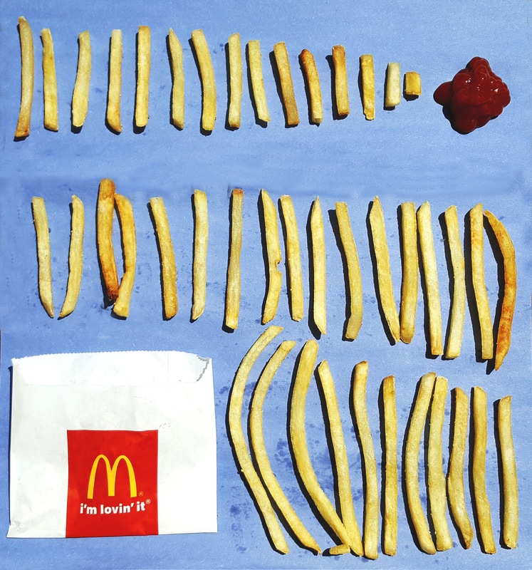
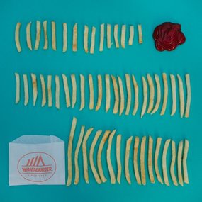
I think of my three images this one most accurately represents the source image. I was very irritated that I could not find a paper that had a similar color to the one in the source image. My paper was much darker and closer to blue than the source. This sets my image off from the source image by quite a bit. My fry bag was also different but I do no think that it had as much of an impact on the final image as the paper color. The lighting in my image is much brighter than in the source. I think that is a bit of an improvement. Overall, I think I did a decent job imitating this image, but it could have been done much better in retrospect.
|
Sugar Rainbow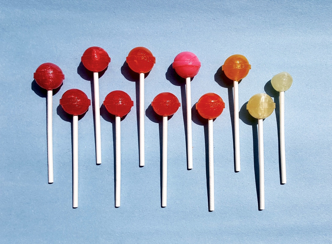
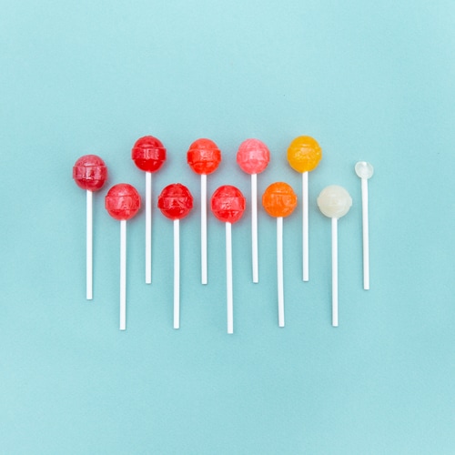
This image I feel is the farthest from the source image. Again the paper color was quite off between the two. This was of particular concern because the paper color in the source image adds a lot to the mood and feel of the image. My picture doesn't capture that same feel due to the color scheme. On top of that the lollipops in the source are much more vibrant and colorful than mine. My lollipops looked much more dull due to the direct sunlight. I also noticed that my lollipops had shadows due to the lighting where as the original did not.
|
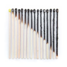
Burnt Ends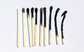
This image was particularly difficult. Again the lighting affected my background, but in this case the color of white was marginally off so the image was not as affected. The matches in my image were much shorter and curved a lot more once burnt than those in the source image. The shorter length led me to have to do less matches in my arrangement than in the original image. Also, I used white tipped matches where as the original had yellow tipped matches. I think the feel of the image was adequately captured in my own regardless of all the minor discrepancies.
|
